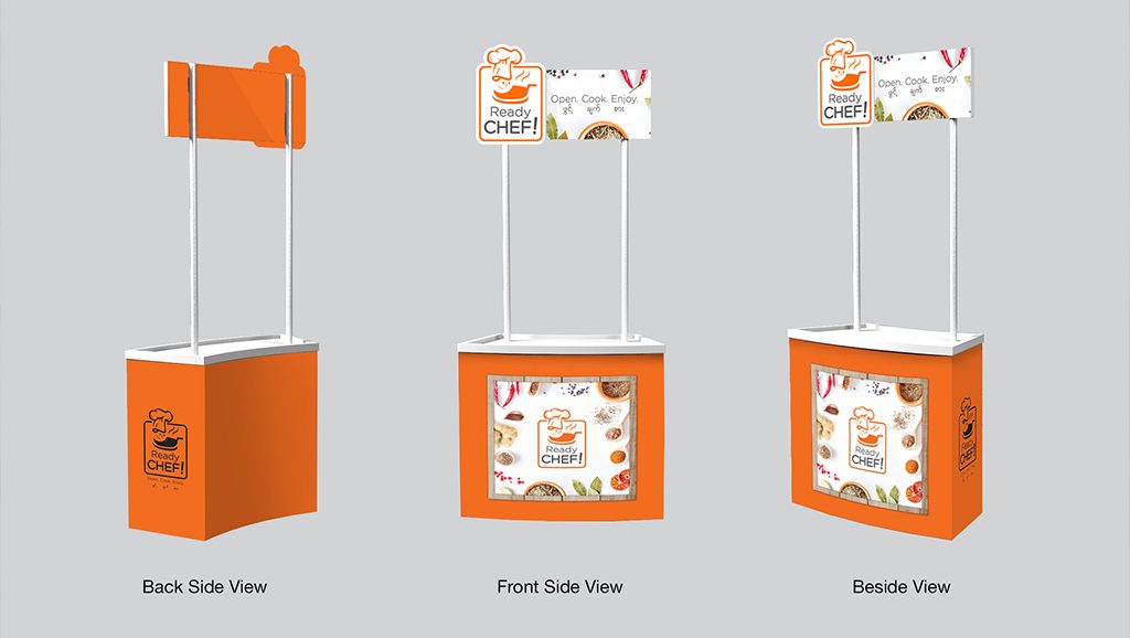
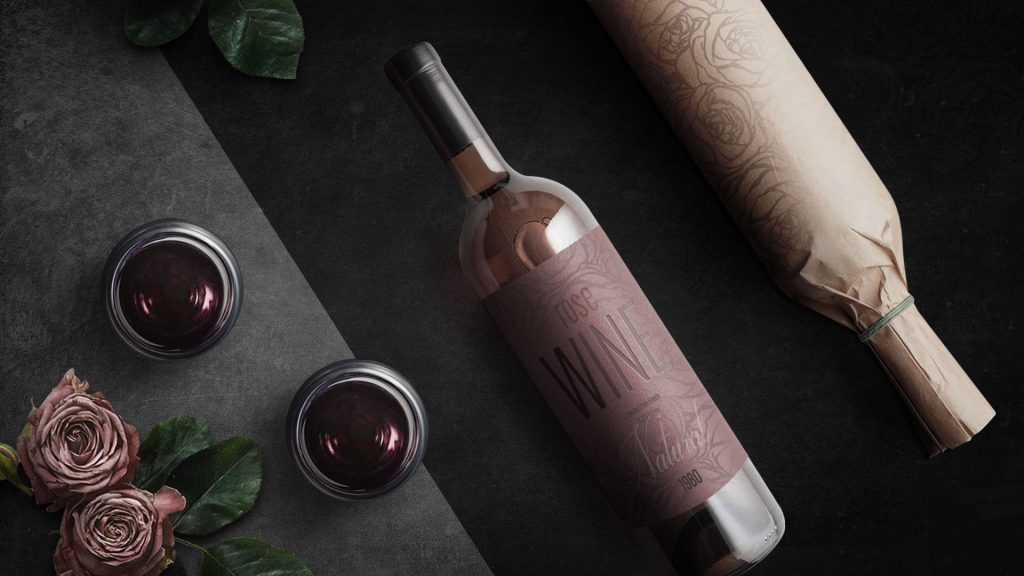
Because packaging is most often the first part of a product that consumers encounter, it’s incredibly important to get it just right. And across the many decisions a brand makes when launching or revising a product’s packaging, color is also thought to be one of the most important… one study even found that up to 90% of consumers make assumptions and decisions about a product based off of color alone.
Here are a few of the benefits your brand can gain by switching up its packaging color, and expertise we bring to packaging design projects in Southeast Asia.
Differentiation
If you’re looking to have your brand make a splash, choosing a category-defying color is a great way to make your product stand out from competitors. If your product is surrounded by muted tones on the shelf, perhaps revamping the packaging with bold hues will attract more attention and convert to more sales. In addition to differentiating a product from competitors, new colors can also differentiate products within the same brand family — different flavors of food and beauty products harnessing different ingredients all employ this tactic.
In the quest for differentiation though, it’s also important to remember to not muddle your brand’s identity or make your product become unrecognizable to longtime consumers. One example that comes to mind is Tropicana’s failed 2009 packaging redesign.
Meaning
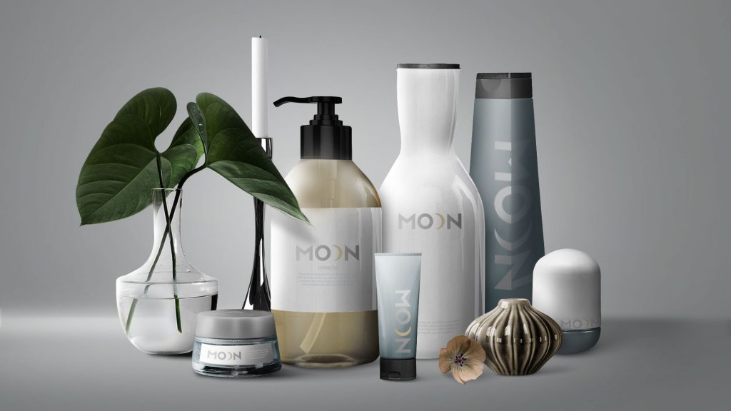
Colors have meanings. Reds are thought to be youthful, energetic, and disruptive, while greens evoke a peaceful, healthy and growth-minded vibe. If you think your brand has a story to tell that isn’t being communicated correctly by the way packaging looks, it’s probably a good idea to revisit how colors can communicate what your brand is all about. By incorporating colors into a brand’s packaging that play into the product’s purpose and the overall brand’s mission, consumers can be informed in mere seconds.
It’s important to remember though, that colors have different meanings across the world and while certain colors, combinations and tones may work well in one market they’re not necessarily guaranteed to translate elsewhere. For example, many western brands that come to Asia adapt their FMCG packaging to be more bright and energetic. These differences make working with people who understand local and regional cultures (like our Southeast Asian team) even more important.
Brand Refresh
If your product is feeling (and looking) a bit dated, incorporating modern colors and inventive new designs are great ways to provide a much needed refresh without changing the product itself. All or some of the world’s biggest brands have needed to stay current was a color refresh, like Johnson & Johnson’s Baby Shampoo. Building off of their iconic design, and simply bumping up the saturation of the yellow colors used on their packaging, they brought a beloved American product into modernity and turned an entire new generation of Moms onto the tradition of buying Baby Shampoo.


