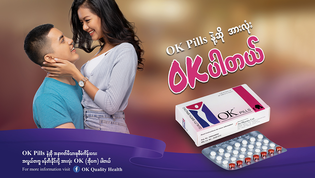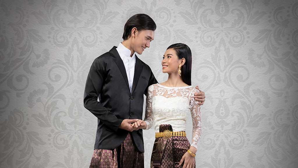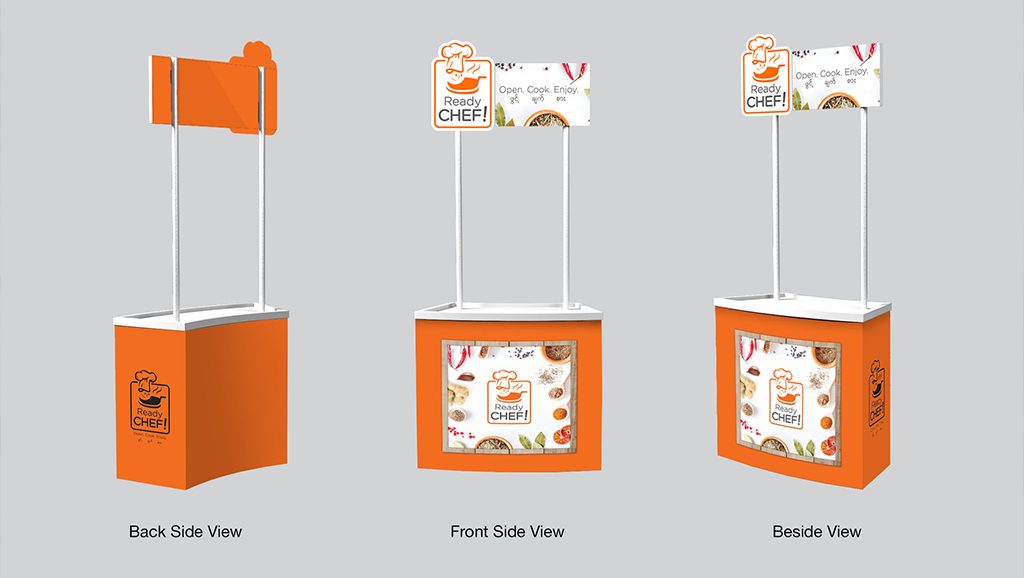
With more and more people having the resources and inspiration to create digital art, completely new design trends are being pioneered every day. But this rapid pace of development can also mean that what may have been popular and modern just a few months ago can seem outdated now. Our team is always on the cutting edge of innovation in the industry, and even more so in our region. Here are a few of the design trends we’re helping to help set in the year ahead, and that we’re excited to use in the work we do.
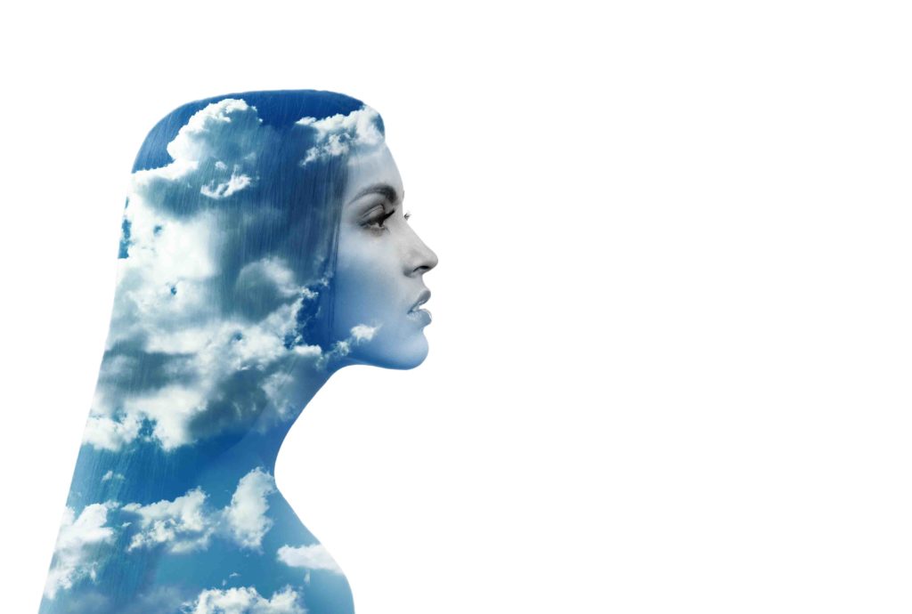
Double Exposure Duotone
While double exposure has also been around for some time, we want to take this trend a step further in 2018 by coupling it with duotone effects. Creating images within images, and combining them with monochrome or opposite spectrum colors, this trend creates dramatic and dynamic visuals that get more interesting the longer you look.
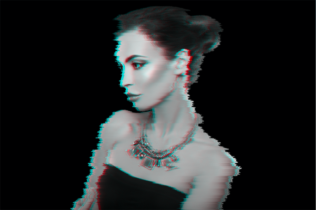
Glitched Images
A glitch is a short lived fault in a digital system, caused by an error that is then automatically corrected. In recent years, with more and more of our lives lived online, entire communities have been created around finding and exposing glitches.
Taking inspiration from the glitches we encounter, this visual design trend purposely distorted images in a manner that is similar to pixelation, and sets a modern and energetic tone.
Vibrant Palettes
While in past years muted or earthy colors may have dominated industry color palettes, 2018 will be all about intense color. In particular, our artists are looking forward to employing holographic, hallucination and distorted reality effects and vibrant color channels to bring dimension and excitement into their work.
Ruined Compositions
While distortion trends have been around for some time, graphics have always been perfectly imperfect. This year, we want to do work that is beautiful because it is unpredictable and unique, taking distortion tactics to new places and telling stories that push boundaries.
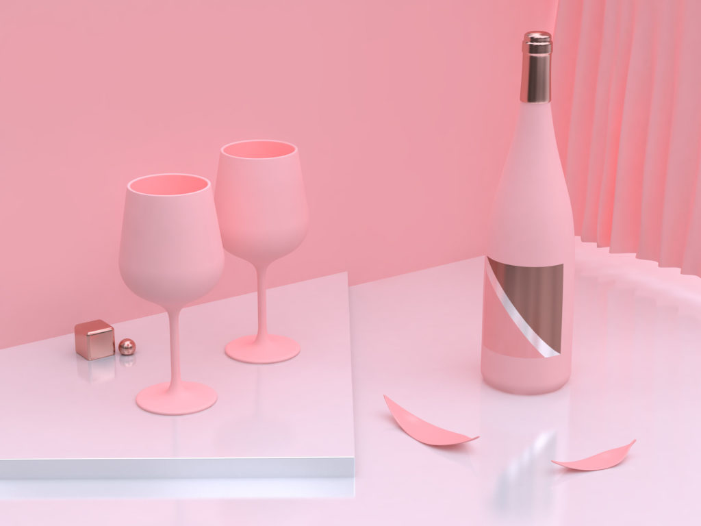
3D Neons and Metallics
Bright colors and 3D compositions will be a winning combo in 2018, bringing unique shapes and shades together for visually compelling design that is equally parts lifelike and otherworldly.
Negative Space
Building negative space into compositions creates simple, yet powerful designs that convey uncomplicated, yet profound messages and meanings. This is a trend that has been slowly growing in the past few years, and we’re reading to take it into the mainstream during 2018. With this trend, artists communicate more with less.
Interactive Typography
Since the beginning of graphic design, typography has remained one of the most important parts of advertising and marketing compositions. In 2018, we expect typography to take new shapes, interacting with the scenes, people and objects in ways that literally brings words to life.

