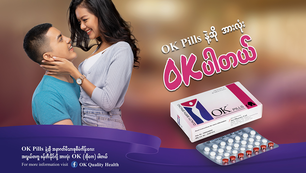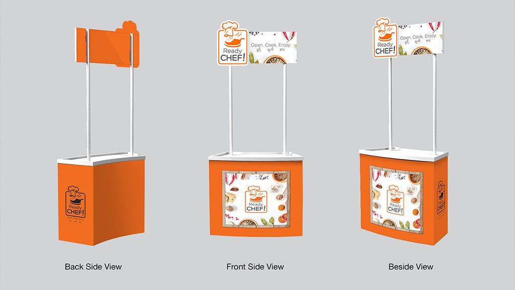
Packaging design is one of the most dynamic mediums in the marketing and advertising industry because products on shelves are always vying for consumers’ attention and new products are regularly being released on to the market. This intense competition pushes marketers and designers to constantly innovate and imagine new and exciting ways to wow consumers — and ultimately, get them to purchase.
This makes it extra important for designers, agencies, and brands to stay up to date on the latest packaging trends. Here are some of the trends in packaging design that we’re looking forward to taking to the next level this year.
Minimalism
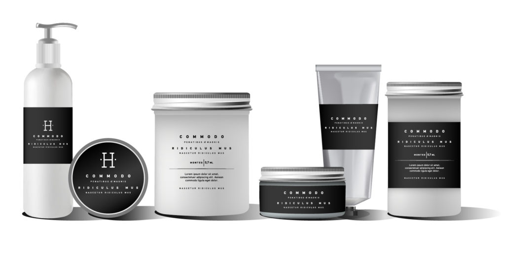
Sometimes, less is more! The key to leveraging minimalism in packaging design is establishing clear symbolism between basic designs elements and the product or service they represent. With a few well placed and well thought out symbols or shapes, a product’s packaging can signal what’s inside and let the consumer’s mind fill in the rest. What’s better, minimalism can be incorporated across other aspects of product design, from stickers and graphics to the actual physical composition of the products and their engineering.
In 2018, we’re looking to pair this trend with bold uses of white space and striking colour contrasts, along with ultra-modern materials and applications.
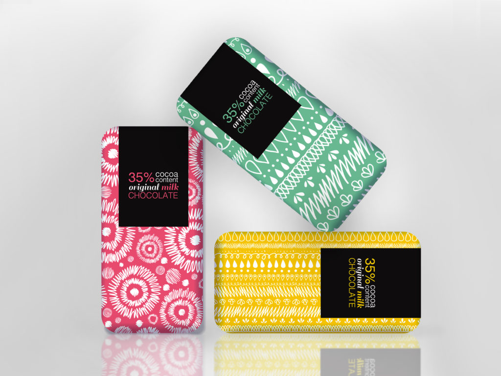
Doodles & Hand-drawn Lettering
In the era of mass production, it’s easy to get swept up in the idea that everything about a product’s packaging should look exactly perfect. But sometimes, purposeful imperfections can communicate more than laser-like attention to detail.
Playing into this aesthetic, doodled and drawn packaging is a trend we expect to continue gaining steam in 2018. It harkens back to the days when we were children, and can easily communicate excitement, energy and a playfulness that is sometimes lost in more serious product design concepts.
Custom, hand-drawn lettering can also give brands a feeling of warmth and genuinity without the youthful connotations of doodles and drawings. Small inconsistencies in type convey a feeling of fine craftsmanship and can signal a hand-made quality oftentimes lost on modern consumer goods. In general though, both of these design trends remind consumers that there are actual people and passions behind the brands.
Pastels
Many brands’ immediately reach for vibrant colour palettes when competing for consumers’ attention, but in oversaturated retail outlets and supermarkets where each product is trying to be as loud as possible, sometimes incorporating soothing colours is the best way to go.
Pastels (or in many cases reduced saturation) colours will continue making their mark in 2018. We’re excited to incorporate these kinds of colour palettes into designs that are trying to evoke feelings of warmth, authenticity, and calmness.
Sustainability
Another trend that is more directly incorporated into the physical makeup of packaging, rather than the design itself, is sustainability. More than a niche interest now, the majority of consumers worldwide are concerned about how their purchasing habits affect the environment. In 2018, brands should be looking to do their part (and attract eco-concerned consumers) by incorporating biodegradable, recycled and even edible packaging into their product lineups.
On a more executable level, it means brands should look at how to use clever packaging design to cut the amount of virgin paper or cardboard used, eliminate plastics altogether, and encouraging consumers to reuse or recycle containers.
Bold Photography
Last but not least, and acknowledging the cliche, a picture is always worth a thousand words. This year, we expect to bring modernized photography into packaging design, focusing on harnessing crisp, simple photos to expertly display products and tell brand stories. We’ll pair desaturated photos with bright packaging designs, look at ways to creatively position and incorporate cutouts, and use photos to give life to products that have too long been ordinary.

